


The brief
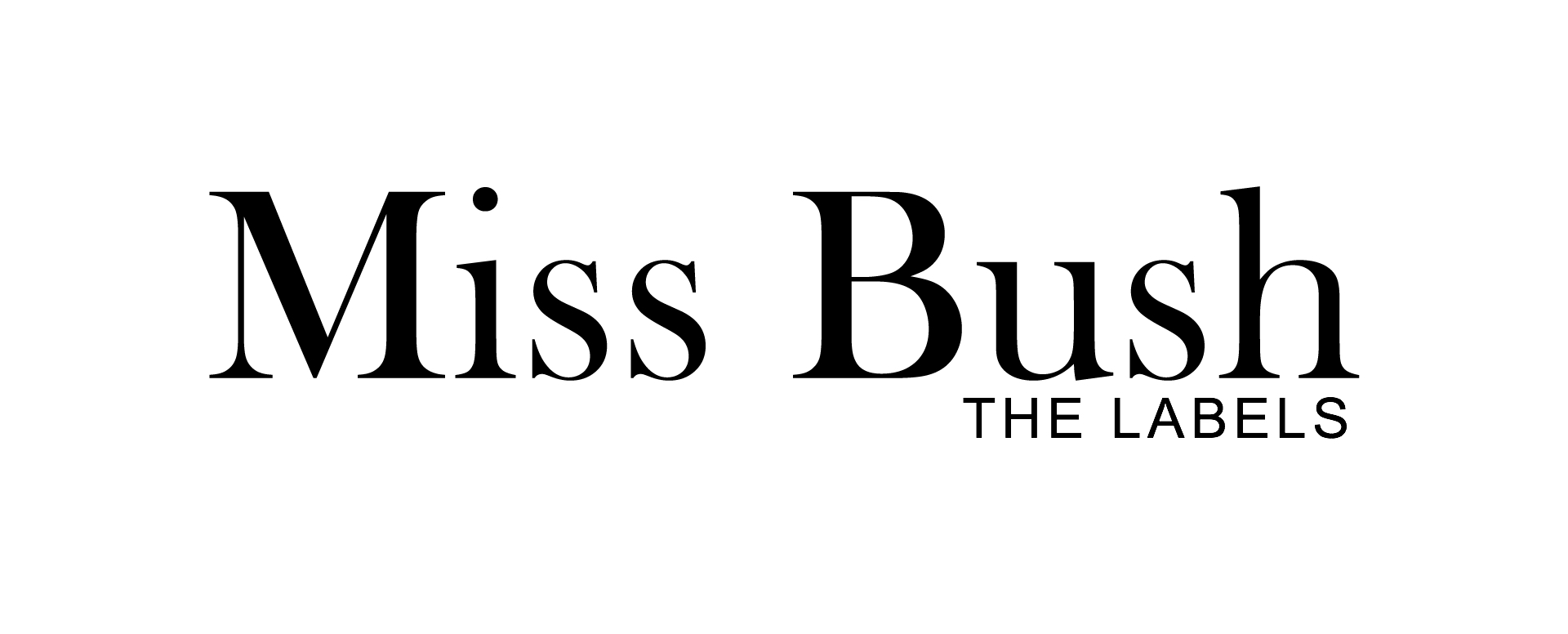
Emma kindly asked me to create the identities for the launch of Miss Bush Bridalwear’s inaugural dress labels, to be named after the designers themselves, Helen Pollington and Laurie Smith.
Both of the designers and labels are aspirational and innovative but each design needed to reflect Helen and Laurie’s individual personalities, styles and talents, and consequently the difference in their collections.
Helen Pollington, the label, is more high-fashion with a modern yet soft, floaty and feminine feel to it. And Laurie Smith is characterised by a sharp cut elegance with a little playfulness.
The designs
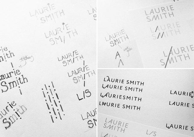
I took inspiration from the style of each collection as well as looking at various other visual sources; from elements of tailoring and pattern cutting to paper engineering, floristry and traditional lettering.
My work also often reflects my love of typography and I always look for happy coincidences, interesting shapes and relationships within the given letterforms by sketching, before moving to a digital format for the final artwork.
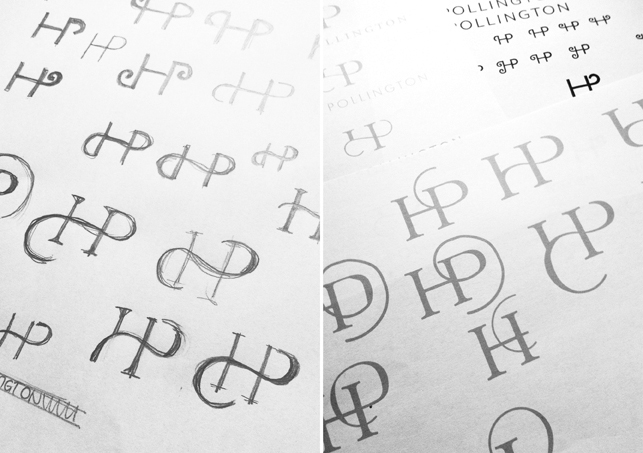
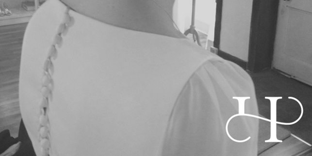
Helen’s chosen identity is a beautiful monogram featuring a soft swash to form the bar of the ‘H’ and to suggest a ‘P’, set with a simple and clean logotype.
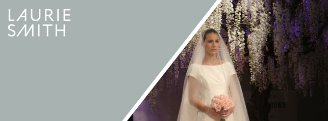
And Laurie’s, reflecting the different direction of the collections, took advantage of some nice angles repeating in the letterforms of the logotype to create a more structural, tailored feel.
I wanted the identity colour palettes to be fairly neutral, and both designers settled on elegant shades of grey.
Tanya x
Tanya Jago – Bureau Design
Simple, elegant and modern typographic wedding stationery and graphic design. www.bureaudesign.co.uk


One response to “The Labels – Design Case Study by Tanya Jago”